Good business website design does one job: it helps the right person decide you’re the right choice, then makes the next step easy. That step might be booking a call, buying a ticket or signing up as an exhibitor. I’ve spent nearly 10 years designing and building websites for businesses across the United States. The sites that bring in the most enquiries, bookings and sales share the same ten features. Here they are in plain English, with the reasons behind each one.
What business website design needs to get right
People rarely visit a business website just to browse. They arrive with a question, such as “Can you help me?”, “When is it?” or “How do I book?” Often, they’re short on time, comparing a few options and reading on a phone.
That changes what business website design needs to do. Whether you run a local shop, a professional service, a venue or a convention, your site has to answer those questions quickly. It also has to build trust and make the next step easy. The details differ from one business to the next, but the features that make it work stay remarkably consistent.
10 features of business website design that win customers
1. A homepage that answers “Am I in the right place?” in seconds
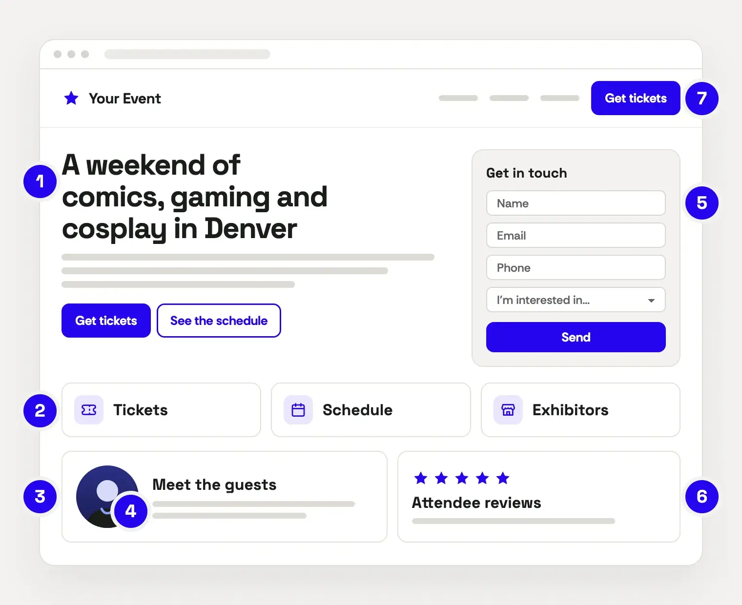
Visitors decide quickly whether they’re in the right place. So your homepage should say what you offer, who it’s for and where or when, before anyone scrolls.
For example, “A weekend of comics, gaming and cosplay in Denver” does far more work than “Where fans come together.” The same goes for any business. “Family dental care in Colorado Springs” beats “Excellence in every smile.” Put a clear button next to it, such as Get tickets or Book a visit, and keep your contact details easy to find.
2. A clear page for everything people come looking for
One page with a long list of bullet points won’t rank, and it won’t convince anyone either. Instead, give each service, product or big question its own page.
For most businesses, that means a page for each service. For a convention or event, it usually means tickets, the schedule, guests or speakers, exhibitors, sponsors, and venue and travel details. On each page, explain who it’s for, what to expect and what to do next. Then add a short FAQ with the questions people actually ask you by phone or email. These pages also do the most for search, because they match what people type into Google.
3. People pages that sound like people
People want to know who they’ll be dealing with. That’s why team bios and speaker or guest pages are some of the hardest-working pages on many sites.
A good bio covers the basics: a professional photo, a name, a role and relevant experience. Then it goes further. Share why you do this work, who you enjoy helping and what people can expect. For events, give every guest or speaker their own page with a photo, a short bio and their sessions. That way, fans can share it and plan their weekend around it.
4. Real photos of your team, your space and your events
Stock photos of handshakes and smiling crowds all look the same. Visitors skim past them because they say nothing about you.
Real photos do. Yet they’re one of the most overlooked parts of business website design. A friendly headshot, your team at work and the space customers will visit all build trust before anyone gets in touch. For events, photos and video from past years are your best sales tool, because packed halls and busy exhibitor floors show newcomers what they’d miss. That’s why I offer event and business photography alongside web design. If you’re planning a shoot, my guide on how to prepare for a headshot covers what to wear and how to relax on the day.
5. Short, mobile-first forms and checkouts
For many businesses, most visitors arrive on a phone, and your analytics will show you the exact split. Either way, your forms need to be easy to fill in with one thumb. That includes contact forms, booking requests, registrations and ticket checkouts.
Keep them short. Ask only for what you need now, and save the rest for later. A dropdown such as “I’m interested in…” helps route each enquiry to the right person, whether it comes from a customer, an exhibitor or a sponsor. Also add a tap-to-call button for people who would rather talk.
Finally, tell people how you’ll use their details. A one-line note by the form, with a link to your privacy policy, builds trust. And if you’d like to send marketing emails, ask for permission with a clear checkbox that isn’t ticked in advance.
6. Reviews, credentials and proof, used honestly
People trust other people. Show your Google reviews, testimonials, awards you’ve genuinely earned, the clients or partners you’ve worked with and any press coverage.
For events, proof looks a little different: attendee quotes, photos from past years, sponsor logos and media mentions. Put this proof where decisions happen: near your main button, on key service or ticket pages and close to your forms.
Keep it honest, too. The FTC’s rule on consumer reviews and testimonials bans fake reviews. Its Endorsement Guides also explain when to disclose a connection, such as a free ticket or a sponsorship.
7. A clear next step on every page
Every page should end with an obvious next step. Usually, that’s a button such as Get tickets or Book a call, a phone number or a short form.
Use the same wording across the site, so people learn what to look for. On phones, a button that stays at the bottom of the screen keeps the next step within reach. For events, update the wording as the date gets closer. For instance, “Get early-bird tickets” can become “Get your weekend pass.” After the event, switch it to “Join the list for next year.”
8. Fast pages on every device
A slow site loses people before they read a word. Google measures this with its Core Web Vitals. In short, the main content should appear within 2.5 seconds, and the page should respond to a tap within 200 milliseconds. The layout also shouldn’t jump around while it loads.
You can test any page for free with PageSpeed Insights. The usual fixes are properly sized images, fewer plugins and good hosting. For events, plan for rush hours as well. The day tickets go on sale or the schedule drops can bring a flood of visitors all at once, so choose hosting that can handle it. Keeping your site up to date helps too, so here’s how to update WordPress without breaking your website.
9. Accessibility built in from the start
Some of your future customers use screen readers, navigate by keyboard or have low vision. An accessible website lets them reach you as easily as anyone else.
The Department of Justice’s guidance on web accessibility explains how the ADA applies to businesses open to the public. It also points to the Web Content Accessibility Guidelines (WCAG) as helpful technical guidance. Aiming for WCAG 2.2 Level AA covers the essentials: readable color contrast, descriptive alt text, labeled form fields and a site that works without a mouse. For events, add an accessibility page as well. Cover step-free access, seating, quiet spaces and who to contact with questions.
10. Enquiries and bookings that are tracked and followed up
A website can only bring in enquiries, bookings and sales. What happens next decides whether those people become loyal customers.
Set up each form to email the right person, send the visitor an instant confirmation and add them to your CRM or email list. For events, automatic reminders before the big day and a thank-you afterwards keep people coming back year after year. Then track form submissions, ticket sales and calls as conversions in your analytics. That way, you know which pages bring in customers, not just traffic.
This is the “workflows” half of what I do. Simple automations like these save hours each week, and they stop good leads from slipping through the cracks.
Design your business website for updates, not just launch day
A website is never really finished. Services grow, prices change and event schedules shift right up to the last minute. So good business website design plans for change from the start:
- Make everyday edits easy. You should be able to update text, photos, dates and opening hours yourself, without calling a developer.
- Use templates for repeat content. Give events, guests, exhibitors and blog posts their own templates, so every new page looks right straight away.
- Keep key details in one place. Dates, addresses and ticket links should update everywhere at once, not page by page.
- Cover the fine print. A privacy policy, a cookie notice and clear terms answer questions before people ask. For events, add your refund policy and code of conduct.
If your team would like to handle updates in-house, I also offer WordPress and Elementor training.
How to tell if your business website design is working
Traffic is nice, but enquiries and sales pay the bills. So check these numbers once a month:
- Enquiries and bookings: form submissions, calls, registrations and ticket sales that come from the website.
- Conversion rate: the share of visitors who take the next step.
- Top landing pages: the pages that bring people in.
- Search visibility: the searches you appear for in Google Search Console.
- Speed: your Core Web Vitals, especially on mobile.
If visitors arrive but don’t take action, look at your calls to action, forms and trust signals first. On the other hand, if nobody arrives, start with your key pages and search basics. For events, compare each month with the same point before last year’s event, since interest naturally builds as the date gets closer.
Ready to improve your business website design?
You don’t need to rebuild everything at once. Start with the feature that’s missing or weakest, and fix that first. Clear pages for what you offer and a simpler form or checkout are often the quickest wins.
If you’d like a hand, I design custom websites and workflows for businesses, conventions and events, built around these ten features. You can find out more about me and how I work. Or get in touch to talk about your project, with no pressure and no jargon.